Work

COPAG
Never not playing

About

Throughout its more than 100 years of history, COPAG has always been deeply committed to preserving its pioneering spirit and leadership in playing card manufacturing. With one eye on innovation for its products and the other on the creative beauty inherent to its category, COPAG has become a beloved part of Brazilian popular culture and one of the most important playing card brands in the world.

While COPAG’s image is well-established in Brazil, its global potential faced challenges after joining the Cartamundi group—the global leader in the playing card market—due to positioning gaps that hindered the brand’s international recognition.

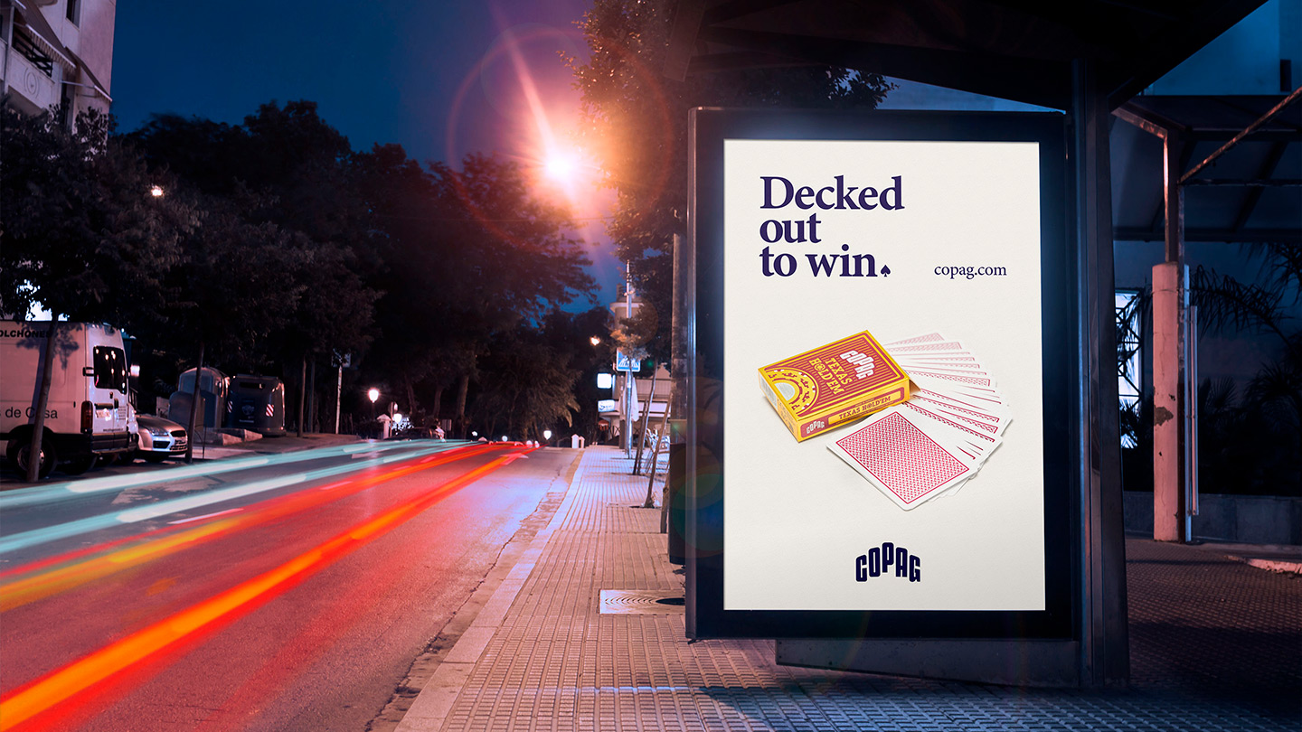
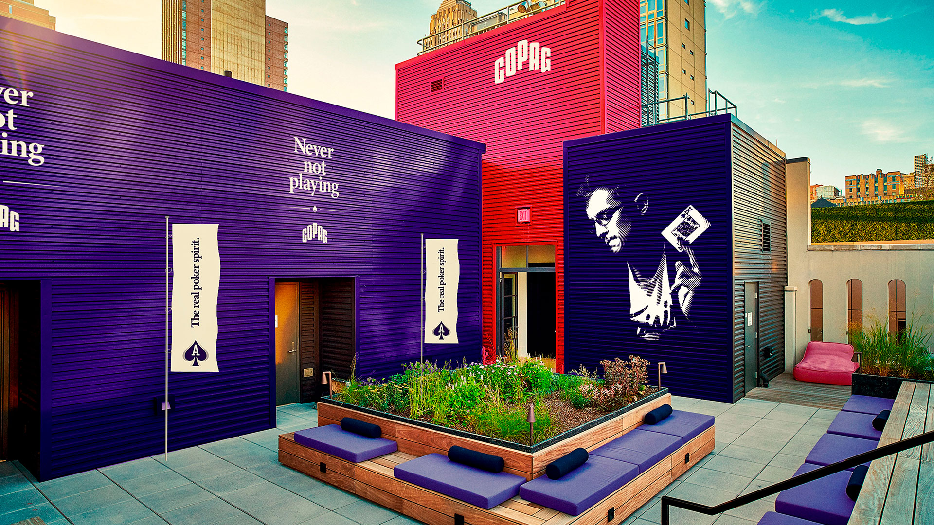
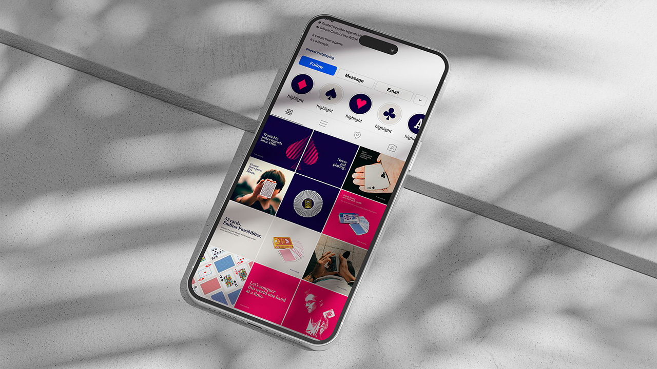
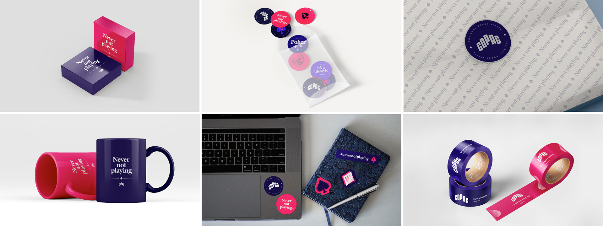
Guided by Cartamundi’s portfolio segmentation strategy, we embraced the exciting challenge of positioning COPAG globally as the definitive brand in the Poker space.

Our Role

Brand Strategy
Verbal Identity
Message Development
Visual Identity

COPAG is a century-old brand challenging the standards of a global category that hasn’t reinvented itself.

COPAG’s history runs almost parallel to the history of Poker itself. However, while COPAG has reinvented itself, many brands associated with Poker have not. After an initial phase of immersing ourselves in the market landscape and consumer behavior, we identified two undeniable realities that opened up exciting strategic and creative opportunities:

First, the shift in consumer habits. In the past, playing Poker was an activity confined to the game itself—once the game ended, so did the interaction with the category. Over the last 15 years, however, this dynamic has transformed. Poker no longer lives solely at the table; tournaments have become more accessible, learning is continuous, and Poker has evolved from a game into a lifestyle. The game doesn’t end when it’s over. This insight led us to the positioning: “Never Not Playing.”

Second, the visual narrative of the category. How could we bring Poker into the present while respecting the collective perception of COPAG and the category itself? We chose to challenge the oversaturated casino aesthetic and the obvious representations it typically entails. The result is a visual identity that draws inspiration from the game’s classic elements while connecting to modernity through versatile, contemporary assets.

Equally important as the strategic and design challenges was defining the right verbal identity and placing significant emphasis on messaging development. The outcome is a verbal expression that naturally resonates with players, delivering a consistent voice that reflects expertise and a commitment to evolving with every hand played.

A branding project designed with meticulous attention to detail, creating the foundations for agile and consistent execution.

As part of the branding project, we were tasked with defining the brand’s behavior across its key communication touchpoints. More than simply showcasing applications, our goal was to ensure an engaging and dynamic language for retail, events, and social media communications.

We also conducted a comprehensive photoshoot that produced an extensive library of assets, providing COPAG’s marketing team with versatile materials to sustain their communications for at least 36 months. The shoots were structured around key scenarios that illustrate COPAG’s relationship with the Poker category.

Project Team

Strategy
Gustavo Arbulu
Isa Ribeiro

Verbal Identity
Isa Ribeiro
Guilherme Tomé
Mau Buchler

Visual Identity
Gabriel Weiss

Photography
Rodolpho Goudinho

Motion Design
Brendon Kowalsky

OBSERVE®. All rights reserved. 2025.

About
Work
Contact

Instagram
Linkedin
Youtube

Services
Glossary
Education